Overview
A playing card system built around the Indian Elephant, with each face card featuring a unique illustrated character and custom micro-animations triggered during interaction.
The project explored illustration, card hierarchy, Figma prototyping, and interaction design. The final deck includes three face cards (Queen, Jack, King), two number cards (5 of clubs, 3 of hearts), and an Ace — each with a distinct visual identity rooted in Indian elephant imagery.
"Each face card has a unique elephant — and each one has its own micro-animation when deleted."
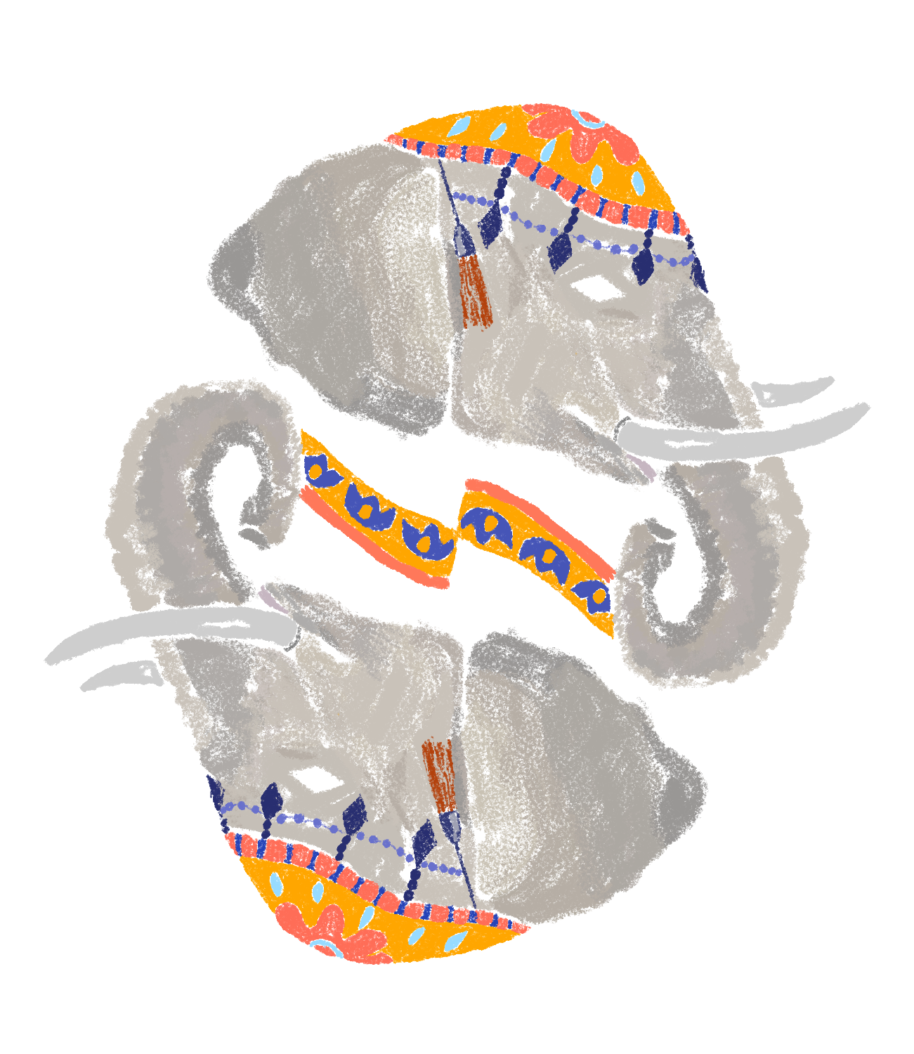
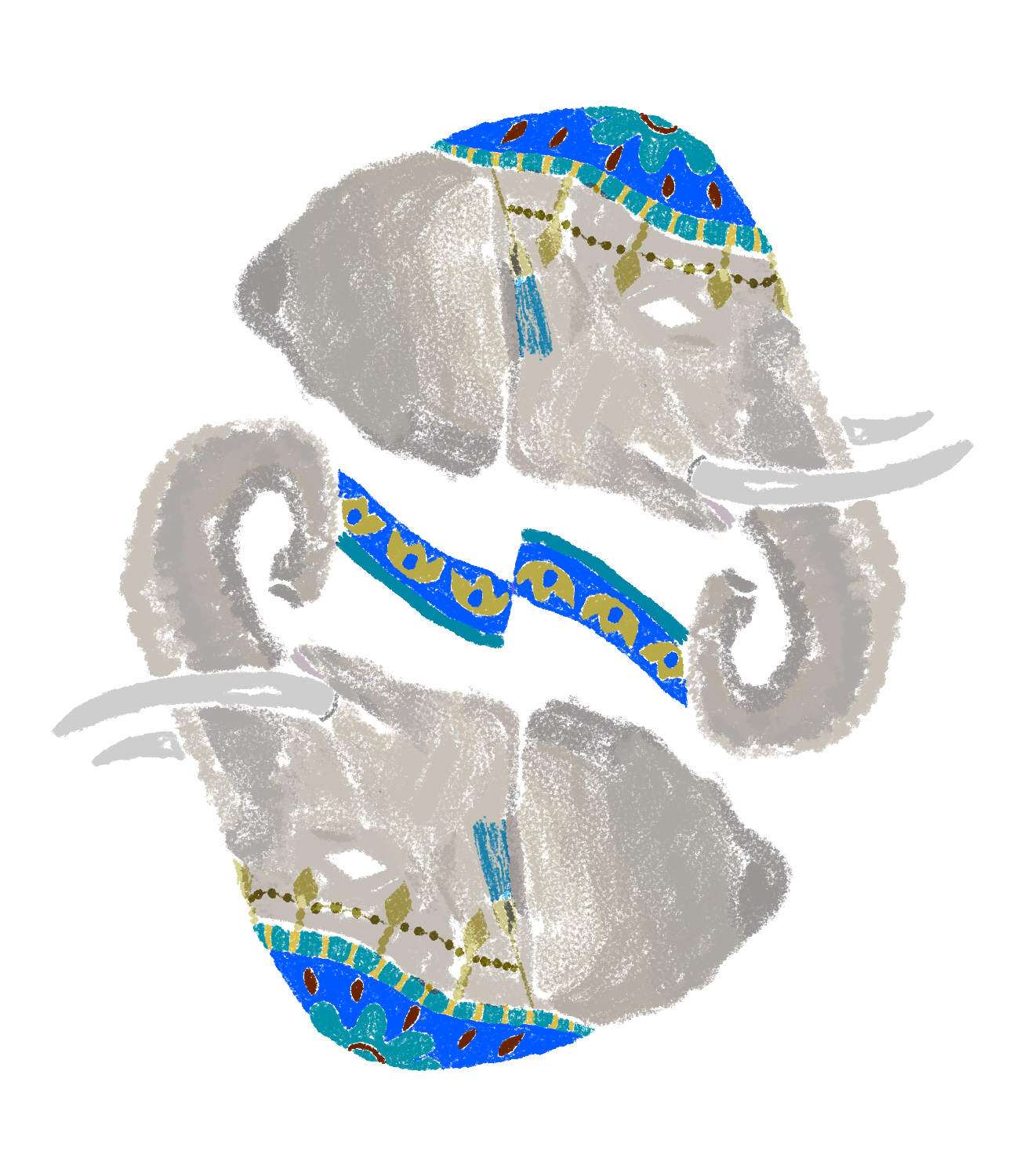
Card Designs
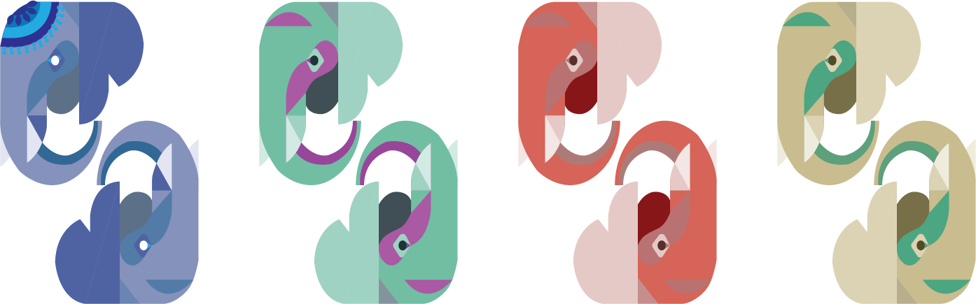
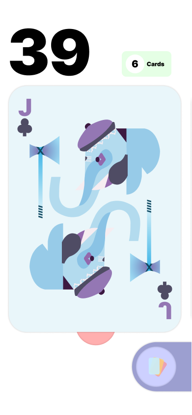
The full deck spans six cards across three suits. Face cards feature illustrated elephants in mirrored compositions, while number cards and the Ace use geometric suit symbols.
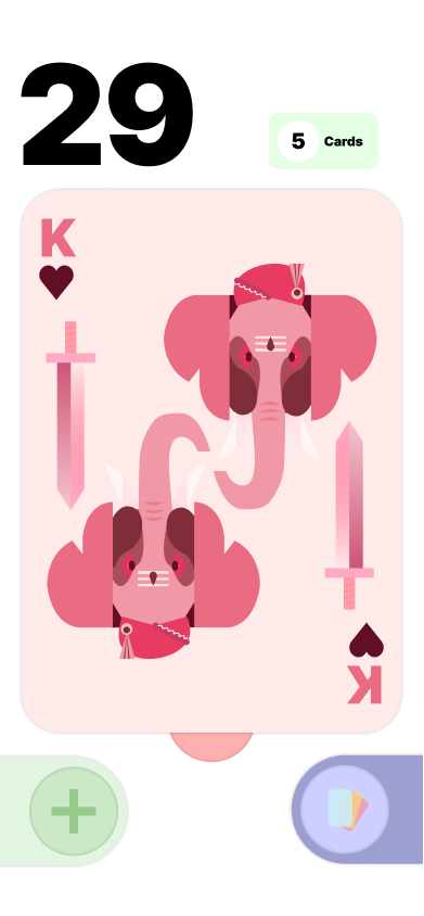
The cards exist in two states: stationary (resting in the hand) and delete (triggered when removed). When deleting face cards, a unique micro-animation plays for each card. The Queen's flower closes, the Jack's hatchet comes down, and the King's turban is lifted as his sword moves down.
Sketches & Iterations
The concept evolved from a multi-animal system to a focused exploration of the Indian Elephant across all face cards.
Initially, my concept was to create a different animal for each face card, each one inspired by the native animals of India. As I continued to ideate, I realized that it would be a better concept to just focus on the Indian Elephant.
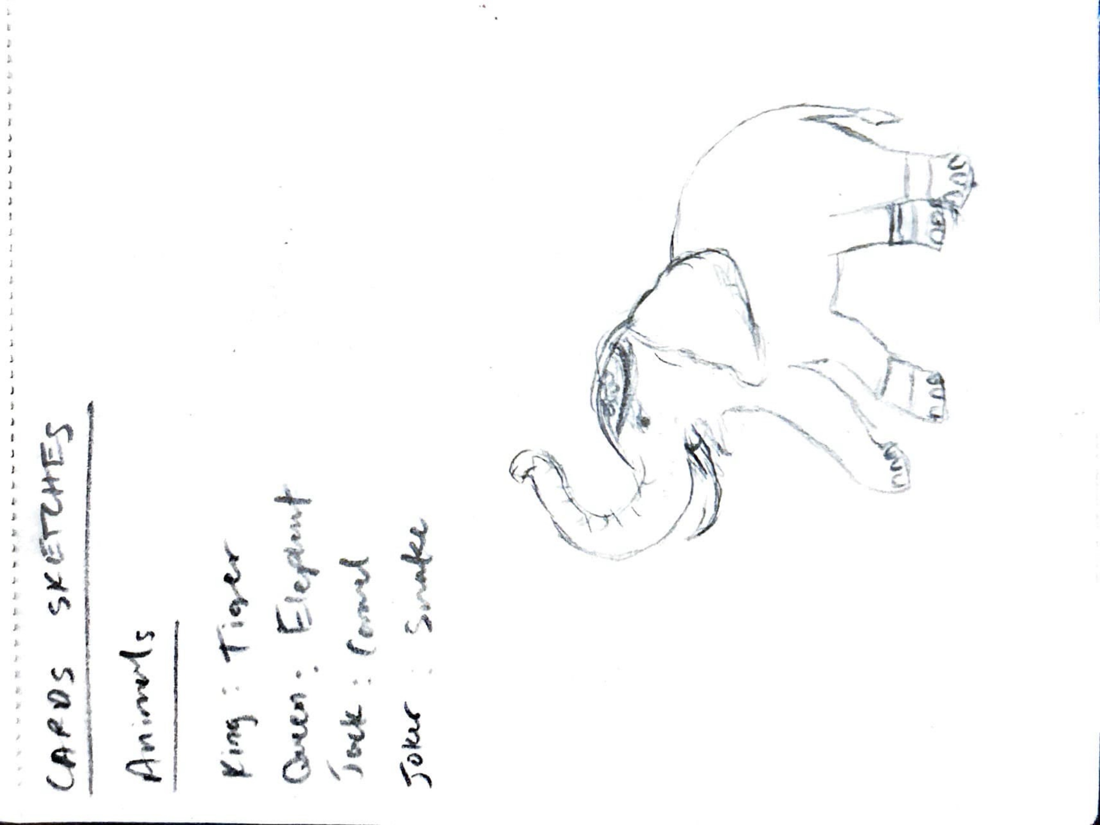
I began with very ornate and detailed illustrations of my elephant face cards. These served as the main inspiration and sketch for the more simplified version.
Digital Iterations
The elephant illustration went through three major digital iterations, progressively refining form, color, and ornamentation.
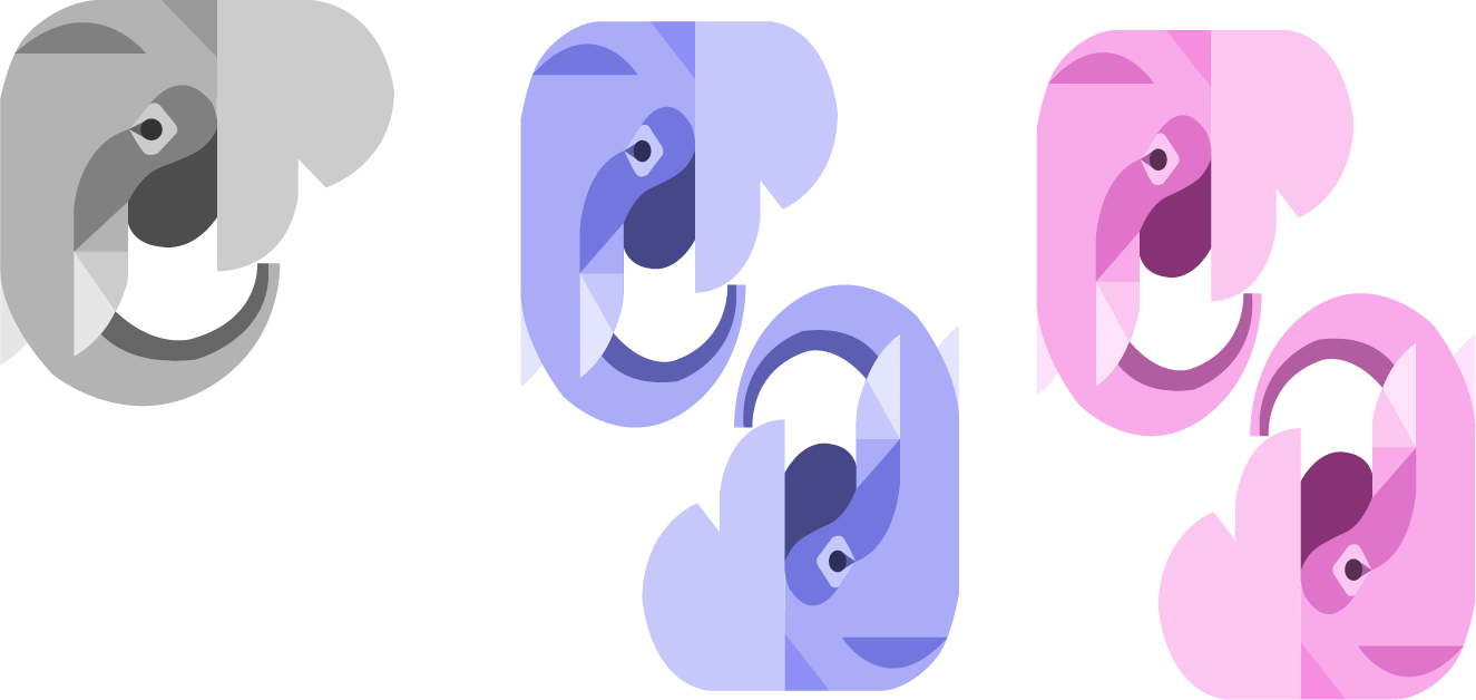
Iteration 1 — Basic elephant. A simplified geometric form establishing the core silhouette.
Iteration 2 — Experimented with scale, positioning, and color. Introduced the mirrored composition and suit-specific palettes (blue for clubs/diamonds, pink for hearts).
Iteration 3 — Added a head decoration element, giving each elephant a distinct personality and cultural reference.
Final Designs
The final card set refined alignment for a stacked UI and gave each face card a distinct elephant character.
Initial version: I used the same elephant design for each face card. The hierarchy of the number cards was also off.
Final version: I changed the alignment of my cards to support a stacked UI. I also changed my elephants so each face card is different — the Queen, Jack, and King each have unique poses, accessories, and color palettes.
Main Screens
The prototype features four core interaction states: viewing all cards, inspecting a single card, adding a card, and deleting a card.
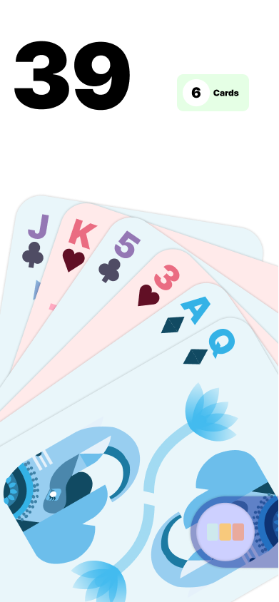
Main View All

View One
Add
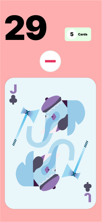
Delete
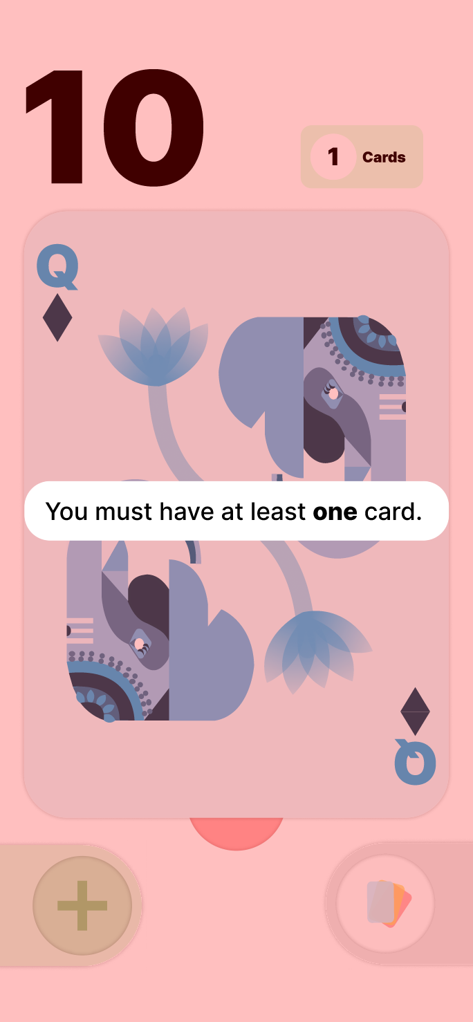
Max Cards Affordance: The add button does not appear until the card count goes below 6, as an affordance — preventing the user from pressing it and getting an error.
Min Cards Messaging: When you try to delete the last card, there's a jiggle effect accompanied by an error message.
Reflection
This project taught me how prototyping in Figma works and let me explore gestures, interaction triggers, and component-based design at scale.
I learned how to use auto-layout to create a visually appealing motion effect. After using swipe interactions in my first few iterations, I decided to use long press instead to add variation in the gestures and keep the user engaged.
I explored using components for buttons, cards, and anything which changes states in the prototype. This helped me quickly make sweeping edits and create multiple variants without painstakingly editing each frame.
To achieve the hand of cards effect, I used auto layout and absolute positioning to hold the cards together and seamlessly transition into even spacing for the swiping module. I wanted to group all my UI elements at the bottom of the screen so they would be easy for the user to press when holding the phone in one hand.
I demoed each iteration on Figma Mirror so I could test how ergonomic everything was. I wanted to experiment with affordances, so the add button doesn't appear until a card is removed, preventing the user from ever having to waste time pressing it and getting an error overlay.
After critique from Mike, I changed the card count button to a more squared shape, as the prior version looked more like a toggle icon. I also changed the color of the bottom buttons to create more contrast when they lay on top of the cards.
Prototyping
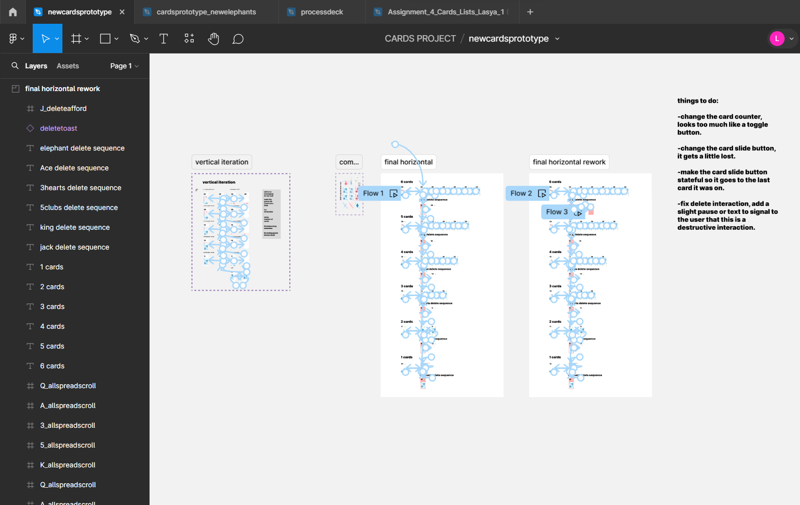
The full interactive prototype was built in Figma, with complex noodle connections mapping every state and gesture across the card management flow.
More work below ↓