Overview
FigBuild Badge is a digital, asynchronous space where FigBuild 2026 participants can create and customize their own conference badge — no anchor school required.
After finding out our school couldn't host FigBuild because it coincided with our school's spring break, the team wanted to channel the same energy into something rooted in Figma's core value: building community. The result is a tool that lets anyone, anywhere, with any discipline, make something personal and share it.
Students who physically attend FigBuild can also scan their IRL badge for a parallel digital experience, bridging the on-site and remote audience into one shared artifact.
"Connect Figma's community — give everyone a fun launch point for FigBuild 2026."
User Flow
The experience is intentionally streamlined — low barrier to entry, maximum throughput across three main sections.
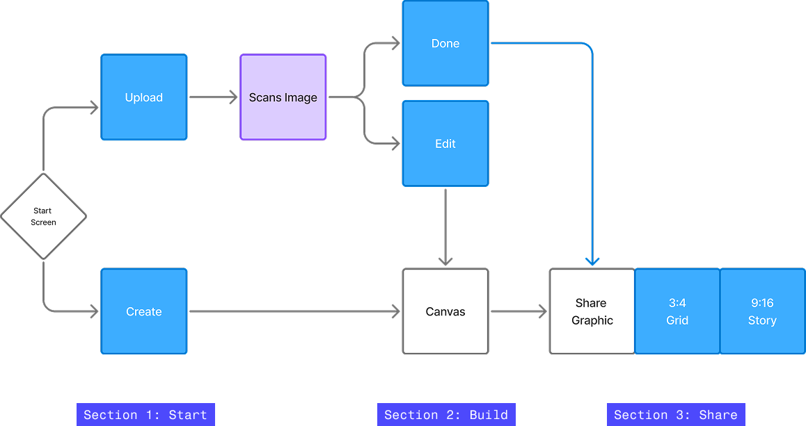
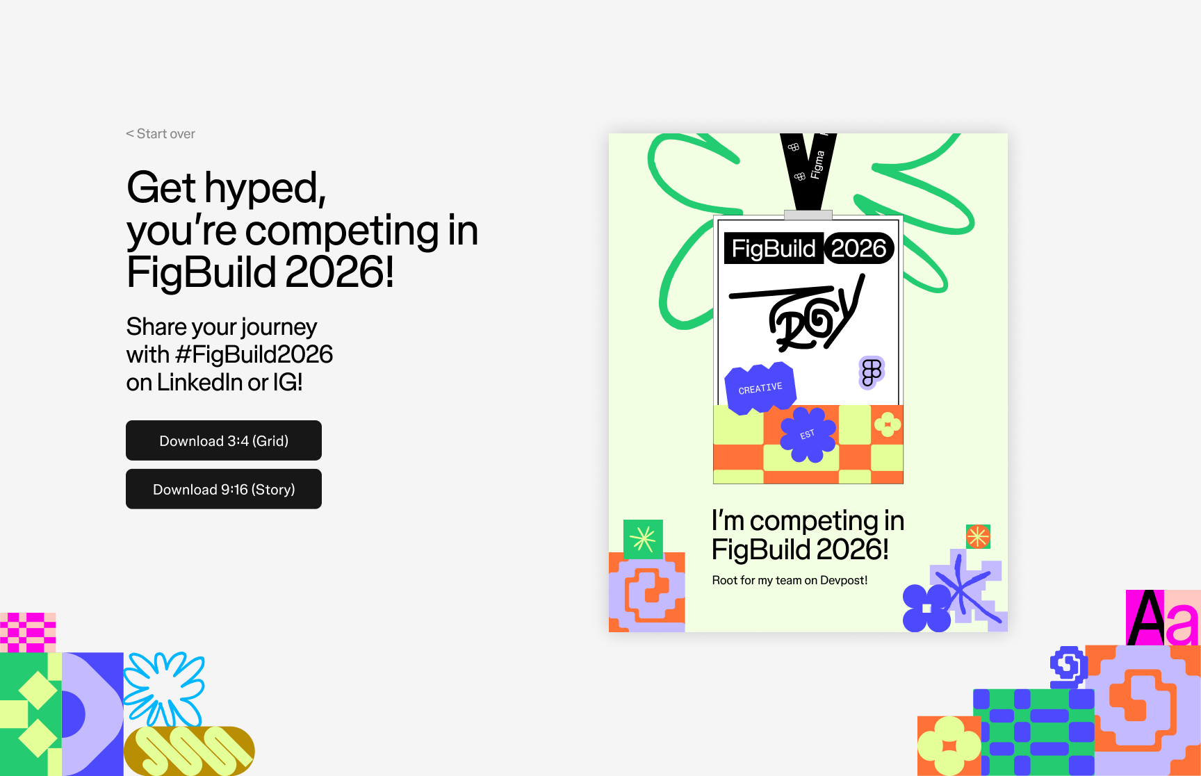
The Upload path runs through an image scan — reviewing the contents of an IRL badge to pre-populate the canvas. The Create path drops the user directly into the modular canvas to build from scratch. Both paths converge at the Share step where the badge is exported as a LinkedIn grid post or an Instagram story.
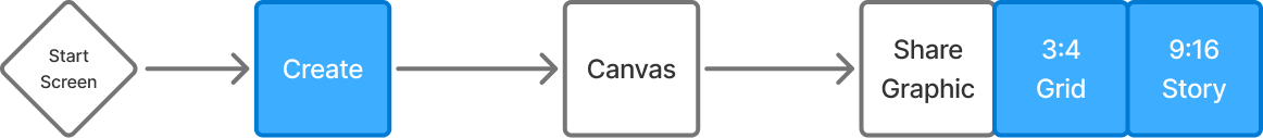
During production, we had to remove the Scan feature due to the incredibly quick turnaround time. So the final user flow looks more like this:
The Canvas
The core interaction is a modular, bento-box workspace where students personalize their badge across four categories: background, border, stickers, and cord.
- Background 3 patterns — Swirly, Creative, Playful
- Border 4 options — None, Dashed, Figgy, Solid
- Stickers 1 per category across Type, Zone, About, Goals, and FigBuild sets
- Cord 3–4 lanyard colours tied to FigBuild's brand concepts
- Draw Freehand tool for signing your name or leaving a personal mark
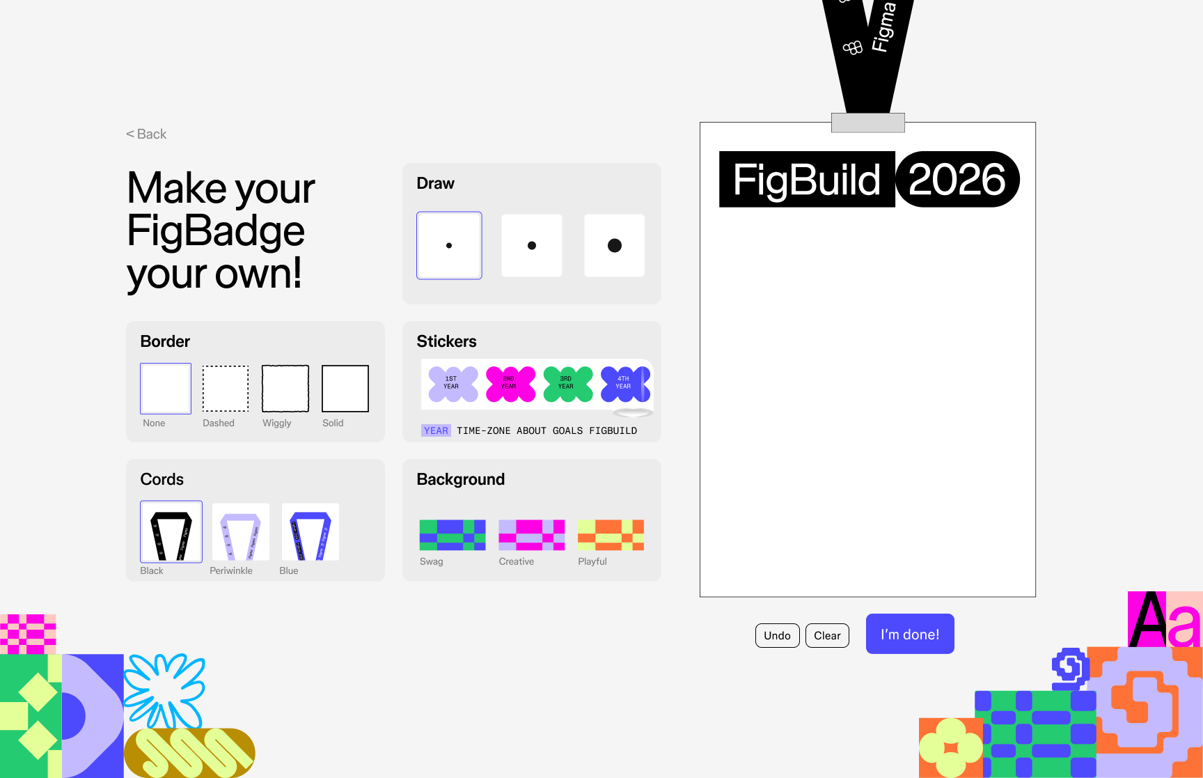
The Sticker Roll
The sticker system was my primary design contribution — a set of FigBuild sticker categorized into rolls, built to feel tactile and playful inside the digital canvas.
When we were initially brainstorming for the project, this idea was one of the first things I came up with. Each sticker is a distinct color and design and the roll format makes the selection feel like reaching for a real Figma sticker.
The full sticker library spans five categories: Year (1st, 2nd, 3rd, 4th), Time (PST, EST, IST, etc.), Pronouns (he/him, she/her, they/them, etc.), About (Introvert, Extrovert, Ambivert), Goals (Here 4 Fun, Here 2 Win), and Role (Designer, Developer, Creative). Each category has its own roll. The core purpose of the stickers is for participants to get to know one another and learn each others skill sets for team building.
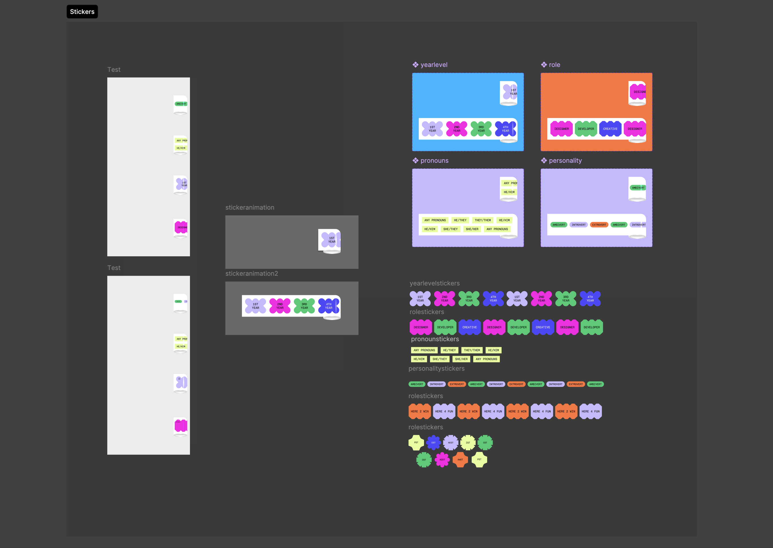
Designing the sticker roll required thinking through the full selection UX — how stickers stack, how a user knows which category they're browsing, and how the 1-per-category intention is communicated without frustrating the flow.
Now that I had the prototype, I could start testing the interaction in code. My first instinct was to build a simple proof-of-concept using Figma Make to create the sticker rolls dynamically. The result was half-baked, but functional enough to validate the concept.
Things were going smoothly, but I ran into a familiar problem.
AI Assisted Production
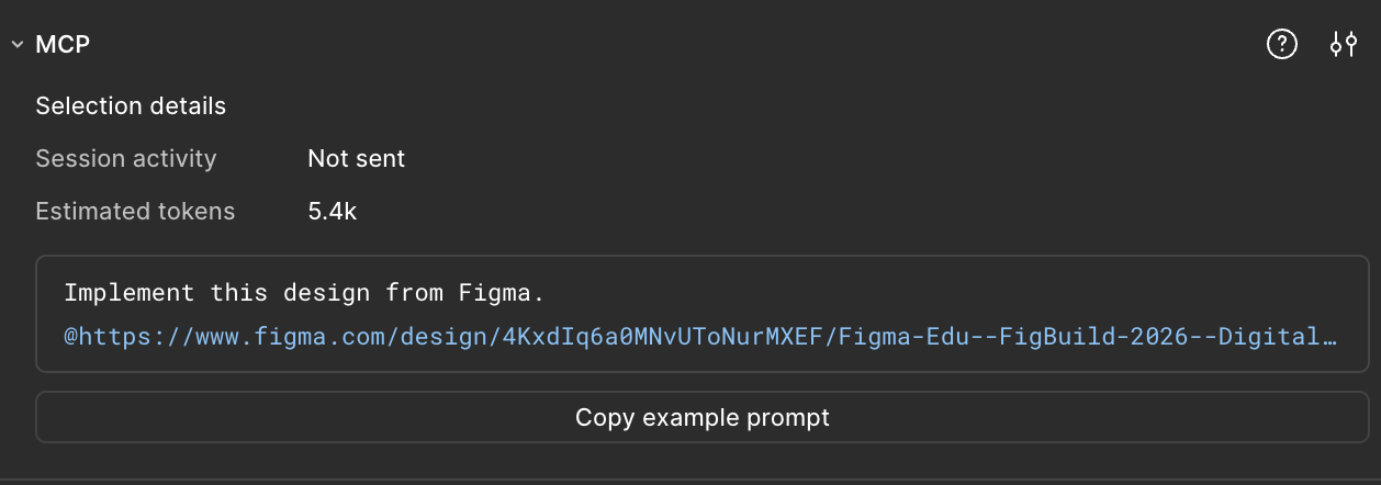
With a one-week timeline and no dedicated developers on the team, I turned to Figma MCP and Claude to bridge the gap between design and code — and to test a genuinely new way of building.
None of us were especially strong coders. Rather than treat that as a blocker, I saw it as an opportunity to explore a machine-assisted production workflow that could expand what our team was capable of shipping.
The workflow centered on Figma MCP, which exposes design context like node dimensions, colors, layout constraints directly to the Claude Code that lived in my terminal. I'd select a component in Figma, pass its context to Claude, review the generated code, correct what was off, and re-prompt. It felt like pair programming: I made the design and architecture decisions, Claude handled the bulk of the implementation, and iteration was key.
The sticker roll was the hardest component to get right and went through 10+ iteration rounds. Early outputs had sticker overlap and spacing issues — the layering order was wrong, padding between stickers didn't match the Figma spec, and the expand/collapse animation timing felt mechanical. Each round I'd identify what was off, describe the fix, and let Claude take another pass.
The moment that sold me on the workflow was the sticker roll animation. Claude generated the interaction where both ends of the roll converge toward the middle, making the whole thing feel dynamic and tactile in a way I wouldn't have thought to code myself. That kind of emergent detail is what makes this workflow exciting to me. It occasionally surprises you with something better.
The initial Figma Make output was a TypeScript React app, and I had never worked in React before. Having Claude as a collaborator meant I could navigate an unfamiliar framework without getting stuck on boilerplate or configuration. The final experience was deployed to GitHub Pages.
Check out the project here → tinyurl.com/figbuild2026badgesThank You
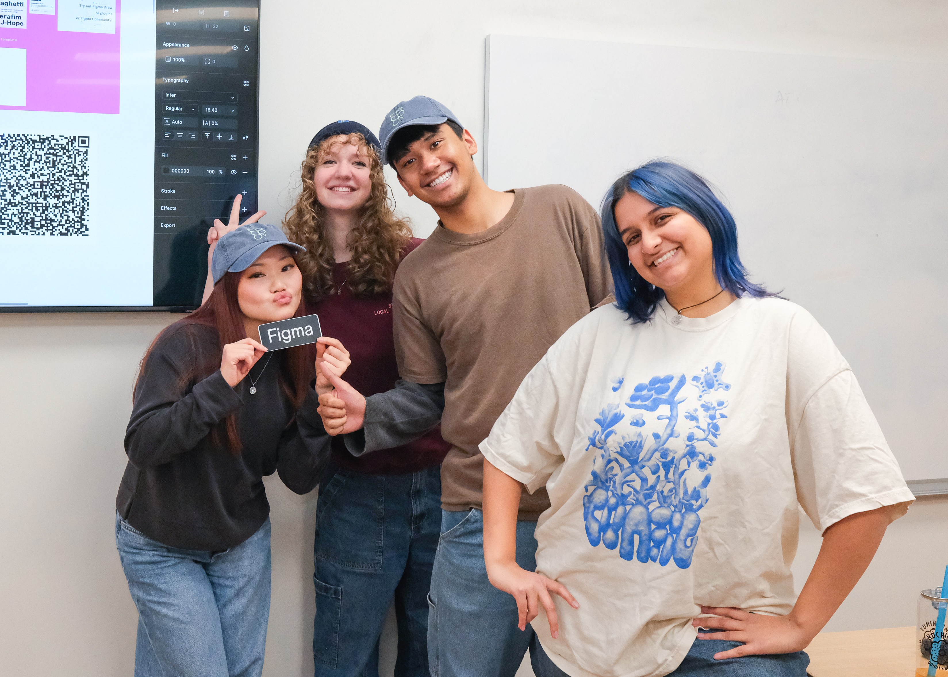
This project could not have been possible without my friends and fellow Figma Campus Leaders, Charlotte Raith, Abby Hart, and Troy Ramiscal. Their belief in me makes me believe in myself! Love you guys <3
More work below ↓